Design spotlight: how the Topicbox logo came to be
Post categories

Head of Design

Many of you would have seen our new Topicbox logo, but did you ever wonder how it came to be?
Before I permanently joined the FastMail Team, I had already been working with David and Neil to help out with some design work. This started with a FastMail website refresh and led to some preliminary work for an exciting new group email product, which eventually became Topicbox.
As we were creating a product and a brand identity from scratch it gave me the freedom to really help shape the design elements and in this post I’m going to concentrate on the Topicbox logo.
Logo design – or really, any general design process – will follow a number of collaborative steps to ensure the brief can be successfully achieved:
1. Kick off meeting
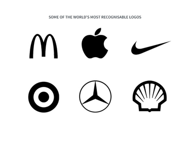
A logo should be distinctive, memorable and an expression of the company it represents and every good design project starts with a kick-off meeting.
I wanted to learn as much as possible from the project team (initially Helen, Neil and David) – things like company values and culture, potential customers and competitors. By gathering up as much information as I could it would really help me to distil all of these elements into the brand identity.
2. Discovery
During this process I took the time to further research the potential customers and competitors in the market place.
Having a better understanding of the customer – or our ideal customer – helped me to understand the types of people this logo had to engage with.
Looking at the competition was important, it allowed me to get a good understanding of what the other brands were doing, so I could then make sure my design was going to be different.
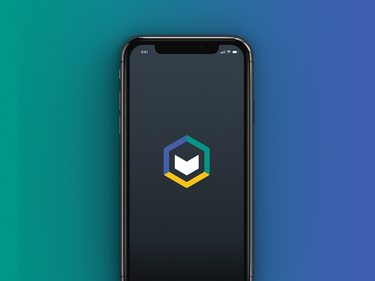
I then looked at the logo application – how and where will the logo be used? Is it going to appear in both print and digital?
Understanding any restrictions that might be applied to the design of a logo means you have already problem-solved any possible solutions to a design before it’s used across its various touchpoints.
For example, a mobile app icon is kept to a fairly small area, compared to that of a business card, which will have less restrictions on things like size and operating systems.
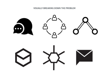
3. Brain dump
This is where some of the initial design starts to formulate. I took all of the knowledge I had gathered up to this stage and started putting my thoughts and ideas together. From there I took these ideas – which could be a sketch or even a list of words – and started to develop these in Illustrator (design software).
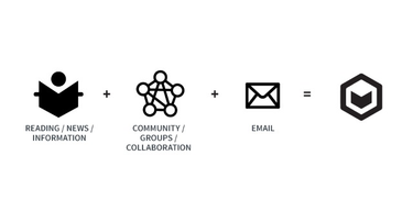
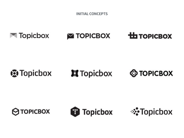
I find that I can quickly get my initial thoughts down on paper, but then I start to break the core idea down using Illustrator. By taking the concepts of ‘group communication’, ‘email’, and ‘archive’ as key inspiration I got my draft designs together and presented these to Helen, David and Neil.
It’s worth noting that as this point I specifically presented these in black and white only. This is so we can focus on the logo design and not be emotionally swayed by colour.
At this stage all feedback is welcome. The feedback is important in allowing me to get a good sense of what’s working and where I need to spend more time developing a concept.
4. Refining concepts
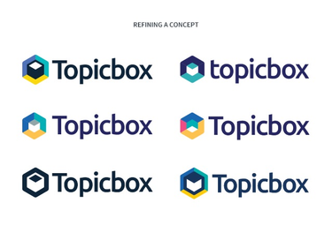
This was probably the most time-consuming and longest part of the process. It involved me going back and forth with the team and refining the logos down to four key concepts.
During this stage I started to introduce colour and how this influenced the design of the logo. I also looked at refining the details within the logo – the curves, thickness of lines and the typography.
The process of refinement can be a challenging one! I remember thinking after a meeting with FastMail, how much further can I push this concept? However, only now when I look back on this do I understand that it was this constant need to keep pushing an idea that allowed me to get to the final execution of my design. It pays to never settle for ‘just good’.
5. Finally … a logo appears!
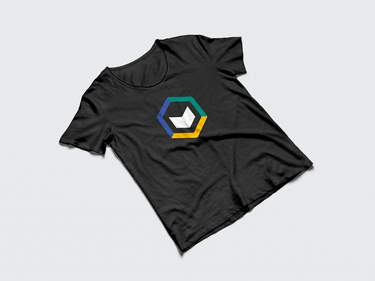
The Topicbox logo has been designed to express a friendly, inclusive and approachable design through the unique graphic style, typography and colours. There are a couple of key features worth noting in the final design of the Topicbox logo:
- The representation of people, collaboration and community is highlighted in the shape and use of colours.
- The 3D box or newspaper icon represents one of the key features of Topicbox – the News Centre which is a daily paper for your organisation.
